How effective is the
combination of your main product and ancillary tasks?
Thursday, 21 April 2016
Wednesday, 20 April 2016
Final Billboard
The billboard promotes the brand identity of my magazine to the public. To convey the brand identity of my magazine I have used the same colour scheme, fonts and emphasised the masthead. My billboard is gender neutral because it doesn't contain any features that are especially feminine or masculine, this conveys that the magazine is gender neutral. My billboard mixes 2-D graphics and 3-D human limbs to create a collage effect that is fun and 'funky'. The leg kicking behind the main heading resembles the logo the 2-D logo of the boot print on my magazine front cover. Also, the finger pointing at the website and Twitter address place an emphasis on the fact I want my readers to interact with the magazine.


Another Audience Feedback Corrections
Since the addition of the angel wings to my billboard I sat down again with the same focus group who had given me the feedback to add more features to see if the billboard now appealed to them. I got positive feedback from the finger pointing at the links and the Twitter bird, however, they didn't understand the concept of having the wings around 'out now'. Instead, I showed them a draft of the billboard without the wings and they preferred it much more.


Changes to Planned design for the billboard
Due to the criticism that my billboard seemed 'plain' near the side more to the right, I have added angel wings around 'out now'. The angel wings correlate with the angelic rays around the magazine. Also, the finger that was pointing at 'out now' is now pointing at the magazine's website address and Twitter address. With this, I have put the Twitter logo next to the Twitter address to clarify what platform the address is for.


Audience Feedback

However, some criticism I received is that my billboard seemed a bit plain near the right side of the billboard. With this, my audience suggested that I should add another graphic element. To correlate with the angelic rays surrounding the magazine, I will create angel wings around 'out now'
Friday, 15 April 2016
Additional Feature to My Billboard
The idea of my billboard is based around, 'comics' and 'collages'. The mixture of the 2-D and 3-D images creates a 'funky' mode of address that is random and fun to attract a young audience where as formal images create an advert targeted towards an older demographic. Also, the mixture of 2-D and 3-D reflects the imagination of a youth's mind.
An addition I have made to my billboard that I didn't include in my original plan was graphic rays of sun/halo rays around the image of my magazine front cover. This suggests the importance and the greatness of the magazine that the people viewing the billboard should invest in.

An addition I have made to my billboard that I didn't include in my original plan was graphic rays of sun/halo rays around the image of my magazine front cover. This suggests the importance and the greatness of the magazine that the people viewing the billboard should invest in.

Thursday, 14 April 2016
Photography for Billboard
To edit the images I have used Adobe Photoshop. On my plan, I wanted to use a low angle shot of a real leg kicking that will convey the logo of a boot print. To do this I took the original image, cropped the background.
The combination of the 2-D print and 3-D leg creates a 'collage' effect which makes the advert seem more immature and fun fro a young audience than serious and realistic.


I went through the same process of cropping and placing with my hands holding the magazine. However, to make the magazine stand out more, I replaced the hardcopy the the front cover with a digital image of the front cover.


Monday, 11 April 2016

Audience Research
From my analysis of various billboards I found that billboards either contain a lot of information or hardly any. With this I asked my people of the age demographic that my magazine is aimed at as to which they prefer and what information would be beneficial for them to see on a billboard.
The majority voted for the brand name, the cover issue and ways in which they can contact the magazine. This is will be beneficial because billboards are to glance at and these pieces of information do not reveal anything about the content which will entice people to buy the magazine to find out what it is about.
Tuesday, 5 April 2016
Software and Dimensions
The softwares I am going to use to produce the billboard are Adobe Photoshop and Adobe InDesign. I will be using Photoshop to manipulate the images, such as brightening colours and cutting around the images I will take.
The table below shows the different dimensions for a billboard advertisement.

Placement of Billboards
The placement of a billboard is equally as important as the design. The billboard has to be in an area where a large audience is able to see it. For the placement of the billboard I am creating that is promoting my regional magazine, and targeted towards teenagers, the ideal area to place my billboard would be near a school. This is because I'd be reaching a mass of my target audience as students in school's are diverse in age and interests and would see this advertisement every weekday. For example, this billboard is located on the same lane as my school:

As well, the billboard is located next to a roundabout and will gain the attention and various types of people who are driving past, from the area and beyond.
Below, the billboard for Time Out London placed in the underground. This is the perfect location to attract their audience as it is the common travel for people living in London so it will gain a lot of attraction. Also the advertisement is for a show that the contributors to the magazine recommend which may entice their target audience of young people to by the magazine to find out what else they recommend.

The Resident Magazine Billboard Advertisement
Now that I know the what makes an effective billboard, this case study on London's regional magazine.
Resident Magazine is one of London's regional magazines. This actually, was the only billboard advertisement for a regional magazine I could find. Maybe the lack of advertising is the reason regional magazines are not as successful compared to other magazine is because of this. However, the billboard is on a railway bridge near a train station and it will be seen by a variety of people including; drivers, train passengers and people passing by.

LED Billbaords Vs Vinyl Billboards
The digitalisation of print media products, such as the normal vinyl billboards into a LED billboards has become an effective advertising medium for outdoor and indoor use. In Wolverhampton, there are no LED billboards to advertise on, so I will be creating a vinyl billboard.
Advantages of vinyl billboards:
Durability- Vinyl is thick and strong, hence it can last for a long duration. It has a high amount of flexibility so can withstand different weather conditions such as torrential rain, wind and snow. As well, vinyl is water resistant and UV Protected. This means water will not was colours away or seep into the vinyl sheet.
Printing and cost- The process of digitally printing a vinyl signage is faster and cost effective. Also this ensures that the vinyl can be shipped across the globe without print getting damaged.
Visibility- Vinyl will provide high visibility because of the placement, size and vibrant colours of digital printing. As a result, it is going to attract more people and create a high brand visibility.
How to Make an Effective Billboard
Now that I have finished my radio advertisement I can start the process of planning for my billboard advertisement. The radio advert and the billboard together will be effective for drivers particularly as the radio advert gives more details about the magazine whilst people are driving and the billboard serves a s a visual aid to illustrate what has been said in the radio advert. Billboard advertising is one traditional medium that has remained virtually unchanged. The increase of internet and social media use created these 'new rules of marketing' however billboard advertising hasn't conformed. Because our brief includes billboard as advertising tool to market our magazine I want to know what I have to include in ours to make it effective and a reliable strategy to gain buyers.
Final Radio Advertisement
My final radio advertisement lasts just over 30 seconds which is typical time for an advert to be on the airway. With this, listeners will not get bored or forget the reason for the advert. During my advert I have mentioned the name of my magazine at the beginning, during the middle and at the end of the advert as a constant reminder of the product also this will notify listeners who have tuned in later what the advert is about. Furthermore, I used the magazine name as a pun at the end, 'kick back and enjoy this issue' to make the name more memorable.
The soundtrack is upbeat suggesting the joyful brand identity of my magazine and will attract the audience when they first listen. However it is much quieter than the voiceover so people can hear the information and not get distracted.
The voices are of a teenage female and male to indicate that the magazine is unisex. Also the voices convey the regional accent which promotes the fact it is a regional magazine.
The radio advertisement concludes with where to buy the magazine and platforms to connect with the magazine like on Twitter.
Monday, 4 April 2016
Uploading My Radio Advertisment to iTunes and YouTube
I uploaded my radio advertisement to iTunes and YouTube so that promotion of my magazine will reach a larger audience. These two platforms were the ideal choice because they are popularly used amongst teenagers and because these platforms promote new content themselves increasing the chances my audience will come across my radio advertisement.
Thursday, 17 March 2016
Audience Feedback for the Radio Advertisement
The feedback I received from my target audience about my radio advert was mostly positive. They responded well to the choice of soundtrack and the cheerful tone of the magazine. Once I had got feedback from my target audience as a collective, I specifically played my radio advert to the people who had previously given me more in depth suggestions for the radio advert as part as my audience research. They also liked the content of the advertisement and the way it flowed from one topic to the other. However, they suggested to re adjust the volume of the soundtrack as the beginning where there is no volume is too loud and doesn't match the volume of the voices.
GarageBand Settings

The Radio Script

The first four seconds of the radio advert will just be the soundtrack to draw the attention of listeners and introduce them to the joyful and energetic mode of address of my brand. After the four seconds the volume of the soundtrack will be lowered so it doesn't cloud the dialogue.
From the feedback I received from my audience, they would understand that my magazine is aimed towards a unisex, teenage demographic if the radio advert used a male and a female speaker. The radio advert begins with the male and female speakers simultaneously addressing the listeners to indicate the advert is aimed towards both sexes. From this point, the speakers only simultaneously talk during important pieces of information to exaggerate the point. For example, the name of the magazine.
The audience suggested that the radio advert should promote stories that are in the magazine, which I have, such as top food and drink places to go. Also I have mentioned the soup kitchen article because it is the first double page spread of the magazine.
The radio advert concludes by informing the listeners on: where they can buy the magazine, the price of the magazine and platforms they can interact with the magazine, for example; Twitter.
The Soundtrack
I have chosen the music for my advertisement before I have written the script for the advertisement so I write something joyful to go with the tone of the song.
The music track for my radio advertisement will be the instrumental for 'Fossils' by Circa Waves. This song is upbeat and light hearted which will set the tone of the radio advertisement. Also, this band is recognisable amongst young people and so as the song will appeal to them and when they hear the song it will remind them of my advertisement. Furthermore, I have decided to mute the vocals of the song so that the lyrics didn't overshadow the speaker in my advertisement.
To use the song, I have emailed the band's record company, Virgin EMI Records, to avoid copyright infringement.

The music track for my radio advertisement will be the instrumental for 'Fossils' by Circa Waves. This song is upbeat and light hearted which will set the tone of the radio advertisement. Also, this band is recognisable amongst young people and so as the song will appeal to them and when they hear the song it will remind them of my advertisement. Furthermore, I have decided to mute the vocals of the song so that the lyrics didn't overshadow the speaker in my advertisement.
Original song

Audience Research for the Radio Advertisement
The target gender demographic for my magazine is non specific and I'm creating something that will appeal to both sexes.
The options for the gender of the speaker in my radio advertisement were; male, female or both. A few of the males that answered my questionnaire preferred to hear a female voice but admitted that it would make the magazine seem like it is aimed more towards females. However, the majority of male and females voted for a radio advertisement with both a female and a male speaker.
I shared a draft of the front cover of my magazine so the people taking my questionnaire had an idea of the mode of address of the magazine that I will portray in my radio advertisement. Because of the bright colours and the 'catchy' name, both genders would like to hear something upbeat and joyful. This will be represented by the up beat soundtrack and by the voices being up tone. This can also be emphasised with the pitch and tone adjustment features go Garageband.
Collectively, my demographic are most interested to hear about the articles that are featured in the magazine and where they can buy it in my advertisement rather than a role play. The reasoning for this is because they tend to get confused about the central idea of the advertisement and sometimes don't understand the wit or humour.
The airtime when the audience are most likely to listen is in the morning during their commute to school and work.
Producing a Radio Advertisement
The software I have chosen to use to produce my radio advertisement is Garageband.
The reasons for this are:
- I will be able to adjust the score, notes, pitch, and velocity of your recording. With this I can authenticate the soundtrack to avoid copyright and also to manipulate the tune so it will match the speakers' voice.
- Garageband allows sharing onto iTunes. iTunes is popular amongst youths to buy and share; music, podcasts, TV programmes etc. and so will be good to share my radio advertisement on here for free as another platform to hear the advert and increasing my listeners.
- The ability to choose and access any bar of the song/track. This is particularly useful when choosing the most appealing rhythms in the song as they tend to peak and fall. Also this is practical because my advertisement will be only 30 seconds where as the song is over 3 minutes so I won't be using it all.
- Specifically target and control any instrument/track (adjust the volume, set the track pan position, mute/un mute track, lock it so it can’t be edited, view/hide the automation and enable/disable the recording).
Examples of Radio Advertisements Aimed at My Target Audience
The radio advertisement for 'Local Biz Durham' is the only regional magazine radio advert I can find. Also, I listen to the radio in the mornings during my drive to school and have been attentively listening to the radio through out the day for an advertisement for a regional magazine and did not hear any. Because of this, I have decided to do analyse radio advertisements that are targeting my young demographic. The examples include small and local businesses to see how they attract their regional clients.
OK! Magazine
By analysing this magazine, it will give me an insight of the conventions of a radio advertisement for a magazine in general.
By analysing this magazine, it will give me an insight of the conventions of a radio advertisement for a magazine in general.
Plymouth University
I have decided to analyse the advertisement for Plymouth University because it is aimed for a young unisex audience like my magazine. With this I will learn how to address my demographic in an appealing way to get them to listen. Also, this advertisement is essentially promoting the Plymouth regional area.
This Plymouth is in Sri Lanka and is clearly indicated with the regional accent which the citizens of the area will be identify with. This advertisement addresses the listeners in a different approach compared to the other two advertisements. This advertisement is a role play rather than one speaker addressing the listeners with a backing track. The role play is quite comedic and witty that relates the benefits of attending this university to real life issues such as the need for earning a lot of money. There is no backing track during the role play but there is during the monologue which will make the listener more alert to the important company details. After the role play a more formal speaker introduces the main ideas of the university and shares their website and telephone information as a way for their interested listeners to get in touch.
Radio Advertising Strategies to sell a Regional Magazine
In an attempt to out weigh the disadvantages of radio advertising I need to know strategies that will assure me a listening audience to convince to buy my regional magazine.
The joyful tone of the backing track plays an important part in soothing and attaining the attention of the listener. This joyful sound reflects the positivity of the regional magazine and Durham in America. The male voice over has a distinctive regional accent which is identifiable to the people living in the regional area. The voice sounded like a middle aged man which would appeal to this listening audience and would direct them to buy the magazine. However, I think the content is a bit wordy and loses the idea of the advertisement. Also there was no 'stand out' techniques to make the advert or the name of the magazine memorable as it was just a man speaking all the way through and only mentioning the name of the magazine at the end. This radio advertisement was over a minute long where as generally radio adverts last approximately 30 seconds, so listening to this got a bit tiresome and the listener would zone out, missing the purpose of the advertisement.
Timing
Having the advertisement air during AM will catch consumers as they are on their way to work. My magazine audience is youths, so also producing a PM ad that will catch them as they are on their way back from education or about to go out when they are most attentive. I think a minimum of 30 seconds for our advertisement would be the best to keep our listeners interested.
Clear Messaging
Because of the limited amount of time to catch listeners' attention I have to use this time efficiently to effectively communicate our message. To ensure that the listeners are left with an understanding of the message about the regional magazine I need to make our point succinct.
Creative Edge
To make the advert creative I will select an uncommon concept or individual method of message delivery. By doing so it will set the advert apart from the other adverts that fill the airwaves.
Repetition
The name of the regional magazine will be repeated numerous times throughout the advert. If I were to state the product name one time, there maybe a risk of listeners not hearing it and, as a result, missing the point of the advert. However, if we are too repetitive, the advert might sound forced and fake.
Example of a regional magazine radio advert- 'Local Biz Duhram'
Advantages and Disadvantages of Billboard and Radio Advertising
As the sales for regional magazines in general are quite discrete because they are not a mainstream buy, I wanted to see the difference billboard and radio advertising could make by looking at the advantages and disadvantages of both of these strategies.

Final Main Product
Front cover

The main image has been taken from inside cafe of the The Way Youth Zone. The Way Youth Zone is a recently opened youth centre and because my target audience is young people this would be fitting for them to get involved with. However, from audience research having a building as my main image didn't sound attractive to my demographic so decided to find an element of the youth centre that is funky, bright and will stand out on a shelf full of competing magazines. The picture contains the centre's yellow logo so people will recognise that the image is associated with the youth centre but also the anchorage text indicates this also. The yellow highlight not only represents the youth zone's brand but also the colours of Wolverhampton. As well, the highlight brings attention to the matter.
The puffs I have used are hints to the content of some of the articles in my magazine. The reason I have chosen these puffs is because they are gender neutral and so will attract both sexes. This gender neutral information is again replicated in the feature at the bottom which promotes other stories in the magazine. The first image of a collection of home grown tomatoes with one ripened, is quite funny and relatable as it shows the difficulties people may face being eco friendly. In this feature there is a puffs staying, 'free guide to Wolverhampton' in a 3D square to emphasising the idea that the magazine has all the information of the regional area.
New Flash from the Editor page

The editors commentary is to welcome readers to the magazine and summarises the content in a way that makes each article relatable in the reader's lives.
The main heading is in two different fonts - 'News Flash' is in 'phosphate' and 'from the editor' is in 'britannic bold', which are the two conventional fonts for this magazine. I have used phosphate in this instance because it is a 'funky' font which matches the fun, catchy phrase 'News Flash'. Also, the orange font doesn't just connote Wolverhampton colours in this instance but the brightness connotes a 'flash' and it will catch the readers attention so that they don't just turn to read the contents page. Furthermore, 'From the Editor' is in black, britannic bold to create a some formality to associate with the editor. As well, 'From the Editor' is in a larger font than 'News Flash' to highlight how the editor cares to personally address the readers, showing the effort from the editor to please the readers. Also, the end of the commentary is a signed from the editor to make it personal.
The image is of the editor looking at a wall full of plans for the magazine. This shows the how involved the editor is to make a magazine that the readers will enjoy. Also, the editor is young, and the young demographic will be able to identify with her. Furthermore, the editor is wearing an orange and black top representing the brand identity and typical Wolverhampton colours. The casualness of the outfit represents the informal mode of address of the magazine and promotes the readers to 'kick back' as if to relax,with the magazine. I have used a spotlight to create a relaxed ambience and to highlight the plans on the wall and the editor.
The very bottom of the page in line with the page number is the name of the magazine to establish the brand and on the following page in the same position is the website address. This pattern continues throughout the magazine and is useful when people are reading an article and they want to find more information on the website they don't have to turn back to the contents.
Contents page
The articles on the contents page are alphabetically ordered and separated into 3 sub headings; lifestyle, music arts and culture and Fashion. This makes the magazine more structured so that the reader is reading thematically rather than just random array articles. Also, these sub headings help the readers locate the topics that they are most interested in, this maybe an article promoted on the front cover. The sub headings are in different bright colours to define the categories.
The all of the images except the 2nd and 5th use natural lighting to show the natural beauty of the different aspects of Wolverhampton. However, the I have brightened the 2nd and 5th images and used a 'chrome' filter that makes the colours more vibrant.
To emphasise the importance of reader input and how the magazine encourages readers from the regional area to get involved with the magazine, the magazine details are presented in an eye catching orange circle that correlates with the brand identity. 'Join In!' is again highlighted in yellow like the anchorage text on the front cover to focus attention on the purpose of the information. The details advertised are the contact details of the editor and the advertising team so readers can communicate their ideas straight to the production team.
Below the magazine details, there is a bright blue Twitter feature advertising another way to interact with the magazine. I have chosen Twitter because it is widely popular platform for teenagers to express themselves. Also, the hashtags and ability for users to reply to tweets my magazine will share, will tell me what they are most interested in reading about and what they aren't.
Next to the list of articles are images related to 5 articles with the page number layered over to visually entice the consumers to read the articles.
Christmas at the soup kitchen page

The magazine is a January issue because that was when I started production so Christmas and winter is still relevant. The soup kitchen article was to praise efforts from the soup kitchen to make Christmas especially memorable for the less fortunate and encourage readers to carry the good spirit into the new year. Also, young people are very interested in volunteering for experience and to volunteer in order to complete qualifications, so this article would give them help finding places to volunteer.
The font for 'Christmas' is the traditional font that is associated with the festival. However, the rest of the main heading is in the conventional font for the magazine britannic bold which highlights 'Christmas' more.
The images were taken at the particular soup kitchen to establish the setting with two long shots and show the efforts the volunteers went through to create a joyful experience for the people who attended. As well, the images shows the great reception the volunteers received. I decided on a mid shot for the image of the volunteers because its shows the happiness on their faces whilst doing their job as well as their uniform.
On the following page is a full page advertisement of the soup kitchen to encourage readers to join. I recreated the advertisement from the original, but I left features of it such as the imagery and font so that it is recognisable as the same soup kitchen if readers happen to see the original leaflet.
The magazine is printed in gloss paper format to seem professional. As well, the first impression of my magazine to a consumer is extremely important and so the quality of the paper will reflect the quality of my magazine.
Tuesday, 15 March 2016
Addition to the Front Cover
I have decided to add a feature at the bottom of the front cover which promotes stories in the magazine that are currently popular in youths sphere. My choice to advertise articles in this form is because the main image is very detailed and colourful so some puffs and text will not stand out.
The stories in the feature include; 'everyone's keen on being green' and 'Tis the season to buy festival tickets'. The first story will attract teenagers because of the popularity of being eco friendly and the second article about festival tickets will attract to teenagers because festival tickets usually go on sale in January, February, March and April and they would want to know the best festival to go to in the summer.
Even though the feature is promoting articles in the magazine, the font is smaller than the puffs because they are the first thing the reader will read from looking at the main image. The square highlighting 'free guide to the City of Wolverhampton' is in 3D so it isn't disregarded on the front cover and implying the magazine contains all the information on the best places to visit.

Changes to front cover
 To indicate that the main image is related to The Way Youth Zone I have highlighted the anchorage text to make it stand out. Also the highlight is in yellow to further connote the Wolverhampton colours and to make the magazine look colourful and 'fun' to attract a younger audience. The font for the anchorage text is the same 'phosphate' font as the the magazine in the masthead to emphasise that this is the main article.
 Changes to the contents page
I have changed a few of the images on the contents page that were too seasonal for example; the ice skating image and baubles. I have replaced these images with an appetising dish to entice the readers to look at a feature article about the top restaurants in Wolverhampton and an image of The Way Youth Zone as further promotion of the article and where to read about it, since the main image of the front cover. However, I haven't used this The Way Youth Zone as my first article because I want the readers to work their way through the magazine to then eventually reach the prime article.


 Another change to the contents page I have made is, rather just informing the readers how my magazine is on social networks at the bottom of the page in the conventional font, I have created the iconic blue Twitter bird with a speech bubble informing the readers of the magazines Twitter address.
Furthermore, I have categorised the articles under subheadings of; lifestyle, music, arts and culture and Fashion to make the magazine more structured and easier for the reader to locate the article they want to read. Also to ensure this, under each sub heading the articles are ordered alphabetical.


 Another change to the contents page I have made is, rather just informing the readers how my magazine is on social networks at the bottom of the page in the conventional font, I have created the iconic blue Twitter bird with a speech bubble informing the readers of the magazines Twitter address.
 Furthermore, I have categorised the articles under subheadings of; lifestyle, music, arts and culture and Fashion to make the magazine more structured and easier for the reader to locate the article they want to read. Also to ensure this, under each sub heading the articles are ordered alphabetical.
Friday, 12 February 2016
Changes to the Editors Commentary
The image for my previous editors commentary was of the editor wearing a soft blue jumper which represented the brand identity at the time. Similarly, in this image the editor is wearing orange and black to convey the current brand.
This time the editor is not facing the camera, but is facing a wall full of ideas for the magazine. I have used spotlight lighting, to highlight the editor which will highlight the editors importance in deciding the magazine's content. keeping the editor's identity anonymous.

Another element I have changed on the editors commentary page is the main heading. Instead of, 'Commentary from the Editor' it is now, 'News Flash from the Editor'. 'News flash' is a phrase young people generally use and having this instead of 'commentary' makes the article seem as if the editor has something interesting to say and important news to share.

Thursday, 11 February 2016
Main Image for the Front Cover
From my audience research, my target audience did not connect with the winter seasonality of my previous front cover. It's definitely necessary to change the main image of my front cover as it is an extreme close up of frosted leaves which conveyed winter.
Instead of having frosted leaves as the main image, it will be focused on a new youth centre called The Way. The Way is a new development built to encourage young people to get involved with their community but also learn new skills as a break away from societal pressures such as school.
However, I didn't think that having a building as the main image will entice a consumer to buy my magazine and this did seem the case as I asked students and young staff around 6th form. Alternatively, I visited The Way to see if there were other elements of the youth centre that would be eye catching and that would make appeal to my young target audience.
In the canteen of the youth centre, there is a graffitied wall that talented young people from across Wolverhampton have contributed to create. Because this wall has been created by youths it is made to attract more youths, which are my target audience. So, having this as my main image will entice young people to buy my magazine. Also, my target audience will engage with the rebellious connotations with graffiti and think my magazine is 'cool', dynamic and relatable rather than just a typical regional magazine.


New Name and Logo

As I have changed the name of my magazine to, 'Kick-Back Wolverhampton', it would be appropriate to change the mode of address to something that will attract a young audience such as the use of bright colours (as this was what was suggested from my audience feedback). This also includes changing the logo.
Immediately, orange is associated with Wolverhampton because it is the colour worn by the Wolverhampton Wanderers Football Club and is a popular part in Wolverhampton culture. Also this goes with the suggestion of using bright colours to attract a young audience and this will make the magazine instantly stand out on a magazine rack. As well, the brightness of the orange makes a powerful statement with 'kick-back' as it is commanding the consumer to essentially to stop their busy schedule and relax with this magazine.
The font I have used is 'phosphate' and intend on having the font for the articles, contents page etc. in 'britannic bold'. Britannic bold gives my magazine some formality but also looks quite 'funky'
I have chosen a boot print as it represents the forcefulness of 'kick'. This image is also easy to remember and associate with the word 'kick' which can be related back to the name of my magazine.
Sunday, 7 February 2016
Audience Feedback

The aim for my magazine was to attract males to read regional magazines as my initial audience research questionnaire revealed that the majority of consumers for regional magazines were females. The feedback I got from the males who participated was that my front cover was over feminised with the font and soft colours. This was also emphasised unintentionally by using the image of my two female friends on the front cover suggesting it is aimed towards females. Additionally, a couple of the males were not interested in the relaxation element of my magazine. Because of this I will not highlight this as much but I won't completely reject the relaxation element because the majority were found of it.
The main changes I am going to make are; to lose the seasonality of the magazine and I'm going to change the name of my magazine to the second most preferred name, from the questionnaire I had previously given out. So the name of the magazine is now 'Kick-Back Wolverhampton'. I have decided to do this because 'Unwind' sounds feminine and because of the relaxation connotations of this name the brand identity with its soft colours and 'fancy' fonts seems fit for an older female audience. However, 'kick-back' does also suggest to relax, but in a quirkier and memorable way.
Thursday, 4 February 2016
Image for the Editors Commentary

The image for the editors commentary is the editor looking down at plans for the magazine, with other ideas in the background. This gives the reader an insight into the preparation and care that goes into the production of the magazine. Featuring a picture of the editor breaks the business barrier between the staff and consumer giving the magazine more of a friendly and personal feel.
I have intentionally wore a soft blue top to correlate with the brand identity of the magazine. This promotes the relaxation element of the magazine as well as wearing a casual jumper rather than a smart, office outfit.
Also, the fact that I'm publicising that the editor is a young person will make the magazine more identifiable to my target audience. This achievement for a young editor will also break the impression of young people being idle that the some of older generation may have.
Friday, 29 January 2016

Changes to the Contents Page

Originally, the plan for my contents page was to have a double page spread with the left page as a full page advertisement of Walking for Health in Wolverhampton (shown above). However, because this is not original content I have decided not to include this in my magazine, but instead replace it with an article from the editor addressing the readers.
Having the editor address the readers at the beginning of the magazine establishes the content in a way that will make each article relatable to the reader. This feature shows the effort that goes into magazine to create a product that specifically the consumers will enjoy and the appreciation for the readers buying the magazine.
Addition to the Front Cover Design

Another change I have decided to make on my front cover from the original design, is a list of areas in Wolverhampton where my magazine is delivered to. My magazine is aimed towards a younger audience with the contents of the magazine such as; fashion and pop culture trends. However, I don't want to alienate the older audience who mostly buy regional magazines as I found in my audience research. This information on the front cover will benefit people who are busy or are at work who are unable to go to a shop to pick up the magazine, this is also ideal for my consumers who may have trouble travelling. By having this information on the front cover, shoppers who do not have the opportunity to buy an issue of the magazine in a shop will know an alternative way of obtaining the magazine.
Additionally, the list of locations where my magazine is delivered to, should increase the amount of people who subscribe to my magazine because having the magazine delivered to you door is more convenient. With an increase of subscribers, the sale figures of my magazine should remain fairly constant- because I'll have a set amount of guaranteed buyers.
My Creation for the Soup Kitchen Advertisement
The leaflet for the soup kitchen article will feature as half of my double-page spread. However, because the local soup kitchen has a small budget for advertising and their leaflet is not up to a high standard, 'Soup Kitchen' on the leaflet is not centred. This effectively makes my magazine look less professional and like an amateur production. Because of this, I have created my own advertisement for the soup kitchen. My advertisement uses the same phrases and identity so it is familiar to readers who may have seen the original advertisement, for example; the logo, puffs, anchorage text.
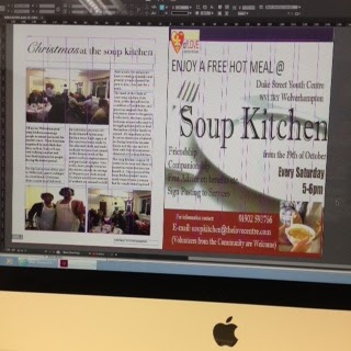

Moreover, I have used a mid shot for the image of the two volunteers to show their joyful expressions whilst they are doing their job. Also this shot shows the standard volunteering uniform. The other two pictures are long shots to establish the settings. One shows the attendees enjoying the food and and the other of the attendees conversing with one another.
Thursday, 28 January 2016
Changes from my Front Cover Plan
On my original plan, the front cover did not feature any other images advertising the content of my magazine. However, I have now decided to feature an image of the ice skaters below the puff that hints to an ice skating article in my magazine. I feel like this change has made my front cover look less 'amateurish' but also giving the reader an incite to the magazine.
Another element I have changed from the plan is for the, 'Winter wonderland' font to be in the soft, 'icey' blue rather than red. This would be a similar colour to the original magazine logo, if it were not a winter edition. The reason for this change are; familiarise the regular consumers to the brand identity considering the titling has changed and the connotations of the icey blue convey an image of a winter wonderland more than red.


Another element I have changed from the plan is for the, 'Winter wonderland' font to be in the soft, 'icey' blue rather than red. This would be a similar colour to the original magazine logo, if it were not a winter edition. The reason for this change are; familiarise the regular consumers to the brand identity considering the titling has changed and the connotations of the icey blue convey an image of a winter wonderland more than red.


Thursday, 14 January 2016
Photography for My magazine
All of the photography used in my magazine have been taken by myself, using my Sony digital camera.
For example; the central image on the front cover of my magazine (shown on the right) is an extreme close up of my christmas tree. I thought this represented the winter theme of my magazine and consumers would acknowledge this at a glance. Also, my research of Southside Magazine and Wolverhampton West Magazine, showed that it isn't necessary for my central image to be of the regional area.

 Wolverhampton, has a number of attractions and special winter events that I go to with my friends, so the images on my contents page are from those day outs. These images will be featured on my contents page as a visual tease of the articles. the page numbers will be layered over the images so the reader can direct themselves specifically to that article.


This was taken at the ice rink Close up of a bouquet of flowers
of my two friends from InterFlora
 The light and sound installations at Wolverhampton Art Gallery


The fireworks at Himley Park
My baubles in their box before
putting them on the tree
For example; the central image on the front cover of my magazine (shown on the right) is an extreme close up of my christmas tree. I thought this represented the winter theme of my magazine and consumers would acknowledge this at a glance. Also, my research of Southside Magazine and Wolverhampton West Magazine, showed that it isn't necessary for my central image to be of the regional area.


This was taken at the ice rink Close up of a bouquet of flowers
of my two friends from InterFlora
 The light and sound installations at Wolverhampton Art Gallery

The fireworks at Himley Park
My baubles in their box before
putting them on the tree
Friday, 8 January 2016
My Page Set-Up on the InDesign Preferences

Before creating a document on InDesign there are preferences you must select according to what you want to create. You are still able to change the preferences you've chosen during and after the creation of your document in case you change your mind.
I have decided that the page size of my print magazine will be A5 to promote the portability of my magazine. due to the small size it is easy for the consumer to keep it on them when they are on the move.
My magazine will have a 'bleed' because half of my double pages and my front cover will have an image that covers the whole page. By having a bleed, there won't be a white border around the pages that will make the magazine unattractive.
Each page will have 6 columns to keep the images and text in line as shown below.

Subscribe to:
Posts (Atom)