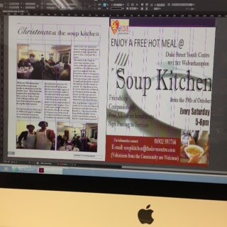
The leaflet for the soup kitchen article will feature as half of my double-page spread. However, because the local soup kitchen has a small budget for advertising and their leaflet is not up to a high standard, 'Soup Kitchen' on the leaflet is not centred. This effectively makes my magazine look less professional and like an amateur production. Because of this, I have created my own advertisement for the soup kitchen. My advertisement uses the same phrases and identity so it is familiar to readers who may have seen the original advertisement, for example; the logo, puffs, anchorage text.

Moreover, I have used a mid shot for the image of the two volunteers to show their joyful expressions whilst they are doing their job. Also this shot shows the standard volunteering uniform. The other two pictures are long shots to establish the settings. One shows the attendees enjoying the food and and the other of the attendees conversing with one another.
No comments:
Post a Comment