Friday, 12 February 2016

Changes to the Editors Commentary

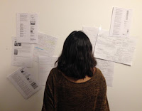
The image for my previous editors commentary was of the editor wearing a soft blue jumper which represented the brand identity at the time.  Similarly, in this image the editor is wearing orange and black to convey the current brand. 

This time the editor is not facing the camera, but is facing a wall full of ideas for the magazine.  I have used spotlight lighting, to highlight the editor which will highlight the editors importance in deciding the magazine's content.  keeping the editor's identity anonymous.


Another element I have changed on the editors commentary page is the main heading.  Instead of, 'Commentary from the Editor' it is now, 'News Flash from the Editor'.  'News flash' is a phrase young people generally use and having this instead of 'commentary' makes the article seem as if the editor has something interesting to say and important news to share.

Thursday, 11 February 2016

Main Image for the Front Cover

From my audience research, my target audience did not connect with the winter seasonality of my previous front cover.  It's definitely necessary to change the main image of my front cover as it is an extreme close up of frosted leaves which conveyed winter.

Instead of having frosted leaves as the main image, it will be focused on a new youth centre called The Way. The Way is a new development built to encourage young people to get involved with their community but also learn new skills as a break away from societal pressures such as school.

However, I didn't think that having a building as the main image will entice a consumer to buy my magazine and this did seem the case as I asked students and young staff around 6th form.   Alternatively, I visited The Way to see if there were other elements of the youth centre that would be eye catching and that would make appeal to my young target audience.

In the canteen of the youth centre, there is a graffitied wall that talented young people from across Wolverhampton have contributed to create. Because this wall has been created by youths it is made to attract more youths, which are my target audience. So, having this as my main image will entice young people to buy my magazine.  Also, my target audience will engage with the rebellious connotations with graffiti and think my magazine is 'cool', dynamic and relatable rather than just a typical regional magazine.


New Name and Logo


As I have changed the name of my magazine to, 'Kick-Back Wolverhampton', it would be appropriate  to change the mode of address to something that will attract a young audience such as the use of bright colours (as this was what was suggested from my audience feedback).  This also includes changing the logo.

Immediately, orange is associated with Wolverhampton because it is the colour worn by the Wolverhampton Wanderers Football Club and is a popular part in Wolverhampton culture.  Also this  goes with the suggestion of using bright colours to attract a young audience and this will make the magazine instantly stand out on a magazine rack. As well, the brightness of the orange makes a powerful statement with 'kick-back' as it is commanding the consumer to essentially to stop their busy schedule and relax with this magazine.

The font I have used is 'phosphate' and intend on having the font for the articles, contents page etc. in 'britannic bold'.  Britannic bold gives my magazine some formality but also looks quite 'funky'

I have chosen a boot print as it represents the forcefulness of 'kick'. This image is also easy to remember and associate with the word 'kick' which can be related back to the name of my magazine.

Sunday, 7 February 2016

Audience Feedback


With the regional magazine as it is, the main target audience ranges from 30-60 (middle aged) because my previous audience showed that people of this age range were the ones buying regional magazines.  However, I have included articles based around topics such as; fashion, sports and places to go on a night out, to try and include a younger audience.

Initially, my aim was to attract young people to buy my magazine and I have lost that appeal with he front cover at the moment.  From the feedback I received from people aged below 30, they preferred if my magazine had a brighter house style, less seasonal and less feminine.

The aim for my magazine was to attract males to read regional magazines as my initial audience research questionnaire revealed that the majority of consumers for regional magazines were females. The feedback I got from the males who participated was that my front cover was over feminised with the font and soft colours.  This was also emphasised unintentionally by using the image of my two female friends on the front cover suggesting it is aimed towards females.  Additionally, a couple of the  males were not interested in the relaxation element of my magazine.  Because of this I will not highlight this as much but I won't completely reject the relaxation element because the majority were found of it.

The main changes I am going to make are; to lose the seasonality of the magazine and I'm going to change the name of my magazine to the second most preferred name, from the questionnaire I had previously given out. So the name of the magazine is now 'Kick-Back Wolverhampton'.  I have decided to do this because 'Unwind' sounds feminine and because of the relaxation connotations of this name the brand identity with its soft colours and 'fancy' fonts seems fit for an older female audience.  However, 'kick-back' does also suggest to relax, but in a quirkier and memorable way.

Thursday, 4 February 2016

Image for the Editors Commentary


The image for the editors commentary is the editor looking down at plans for the magazine, with other ideas in the background.  This gives the reader an insight into the preparation and care that goes into the production of the magazine.  Featuring a picture of the editor breaks the business barrier between the staff and consumer giving the magazine more of a friendly and personal feel.

I have intentionally wore a soft blue top to correlate with the brand identity of the magazine.  This promotes the relaxation element of the magazine as well as wearing a casual jumper rather than a smart, office outfit.

Also, the fact that I'm publicising that the editor is a young person will make the magazine more identifiable to my target audience.  This achievement for a young editor will also break the impression of young people being idle that the some of older generation may have.